
|
|
|
#241
 06-05-2018, 12:44 PM
|
||||
|
||||
|
Manual setting at 1/30. Stopped using the cell phone camera, now that I have a better camera. The good news is, I can “control” the color balance by taking multiple shots and choosing the closest to the actual image and my eyes.
I’ve seen the dark “shutter” bar on photos elsewhere. Going to try your settings .... and defocusing. 
|
|
#242
06-05-2018, 12:44 PM
|
||||
|
||||
|
I looked up the A6300, and I see it has a choice of mechanical shutter or electronic shutter only ("silent" mode). I suggest you look for how to set it for one mode or the other and try both to see what works, with the shutter speed still set manually to 1/30.
|
|
#243
06-05-2018, 01:04 PM
|
||||
|
||||
|
Quote:
Best to use natural light to avoid shutter bars, or make sure your light source cannot flicker with the building's AC.
__________________
Tom C. Zenith: The quality stays in EVEN after the name falls off! What I want. --> http://www.videokarma.org/showpost.p...62&postcount=4
|
|
#244
06-05-2018, 08:39 PM
|
||||
|
||||
|
Shot in Manuel mode, 1/30 sec., F8, ISO 2000. Mechanical shutter.
More consistent color balance from shot to shot. Morie effects show up more in this mode. I had to go up to 2000 ISO to get the brightness to match the screen. Noiser images.  
Last edited by etype2; 06-05-2018 at 08:44 PM.
|
|
#245
06-05-2018, 11:26 PM
|
||||
|
||||
|
Looking good, but if you find them too noisy, you should try one stop bigger aperture (f/5.6, which will probably still be sharp) and ISO 1000 at 1/30 second. Pick whichever combo gives you the best overall results.
|
| Audiokarma |
|
#246
06-07-2018, 05:45 AM
|
||||
|
||||
|
Took up Waynes suggestions and shot a bunch of photos using manual control, 1/30 sec, F5.6, ISO 1000, white balance shade and mechanical shutter. The lens aperture is 3.5. Pleased with the results except the shots are prone to moire interference almost every shot. Its hard to say if the photos are less sharp and noisy. Judgement call?
Duplicate shot of Marilyn for comparison.       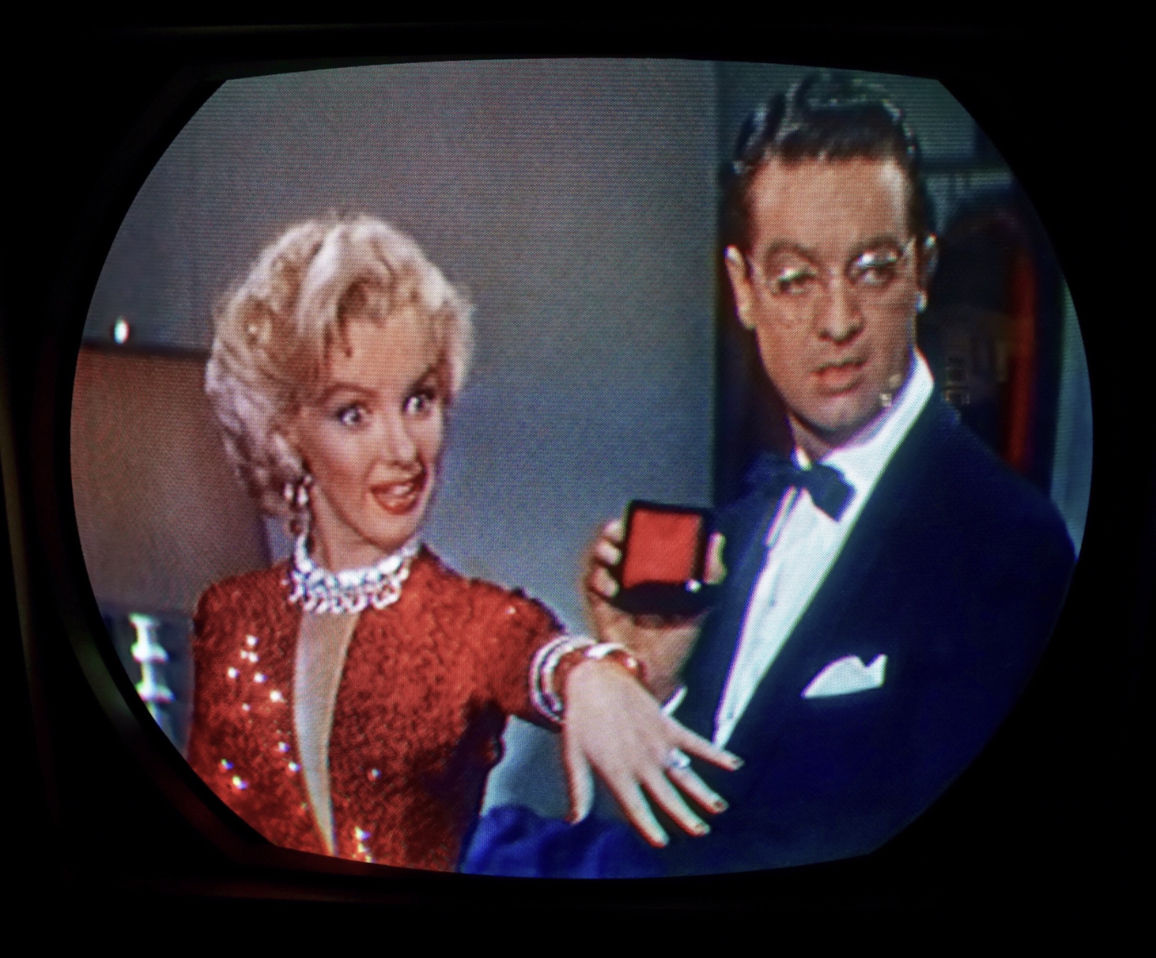  Do you like red? The 21AXP22 uses color phosphors with correct chromaticity corresponding to the NTSC standard.   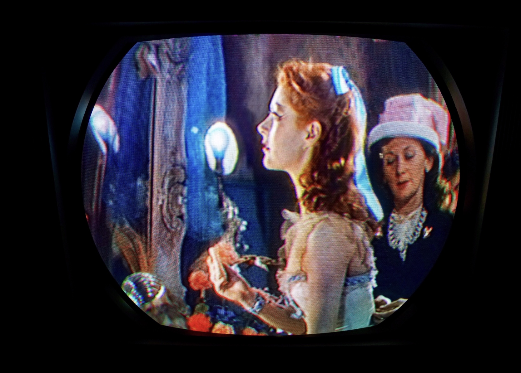  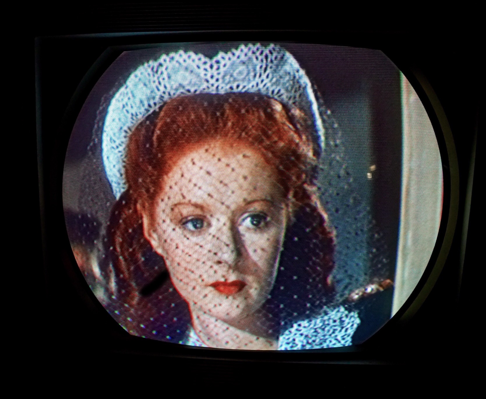
Last edited by etype2; 06-09-2018 at 03:13 PM. Reason: Add photo new photo remove photo, add photo
|
|
#247
06-10-2018, 11:54 AM
|
||||
|
||||
|
1954/55 RCA 21CT55 VS 2004 SONY KD-34XBR960.
How does the first RCA 21 inch color television compare to the highly regarded Sony HD KD-34XBR960? We assembled a few comparison photos to find out. Both sets were adjusted to display the best possible images to my eyes. The Sony was in the factory “Pro” picture setting mode and it was not ISF calibrated. Please excuse the stretched 4X3 to 16X9. We found while using the Sony A6300, the best method for shooting screen shots, was Shutter Priority 1/15 sec., ISO 1000. The settings reduced the shutter bar and moire effects.    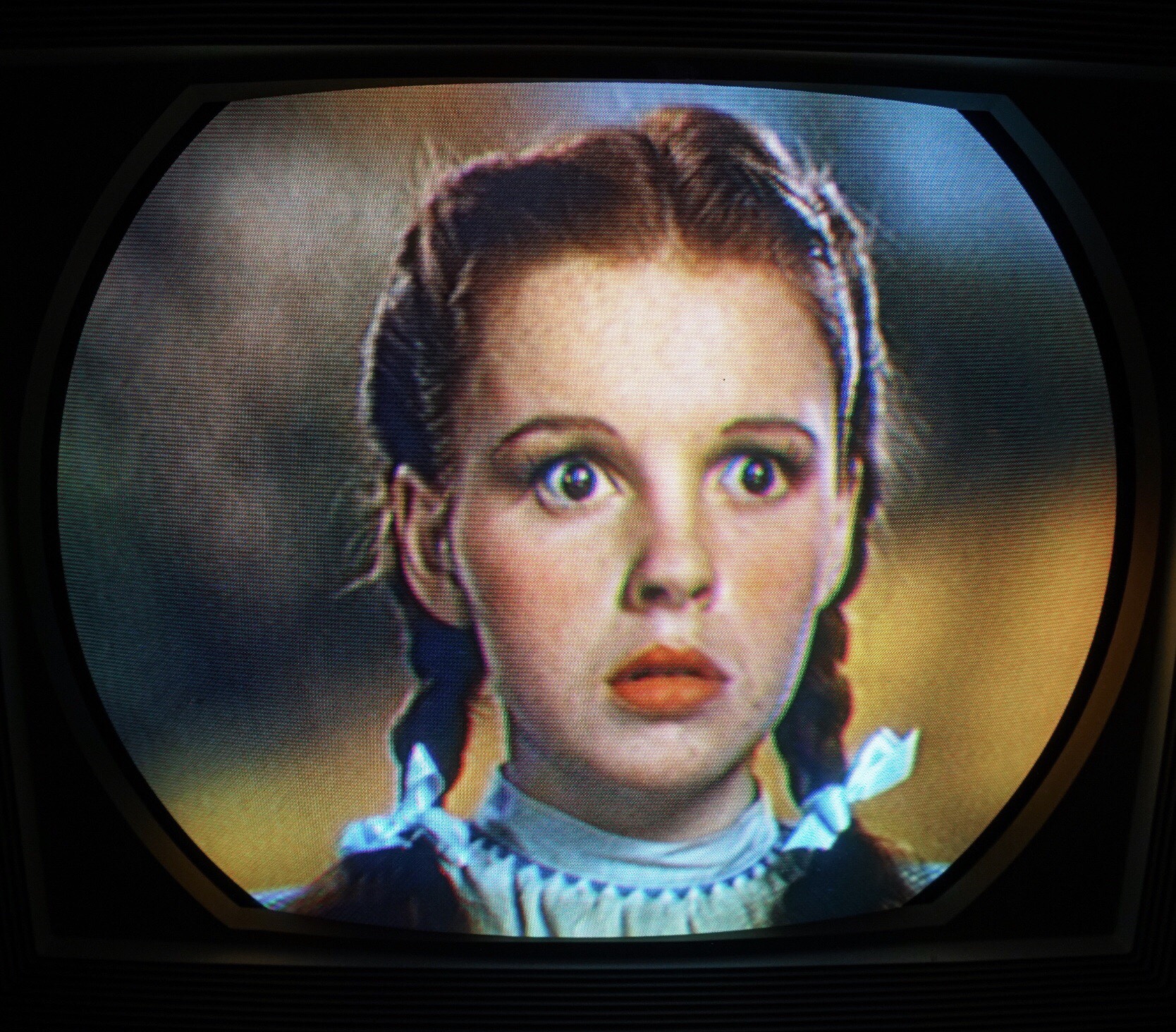  Edit: June 11, 2018. Sony white balance set to “Sun” on Marilyn and Dorothy photos.      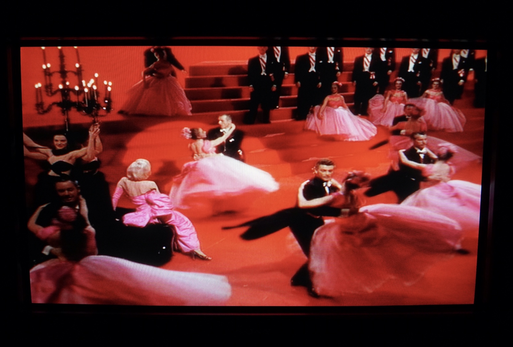  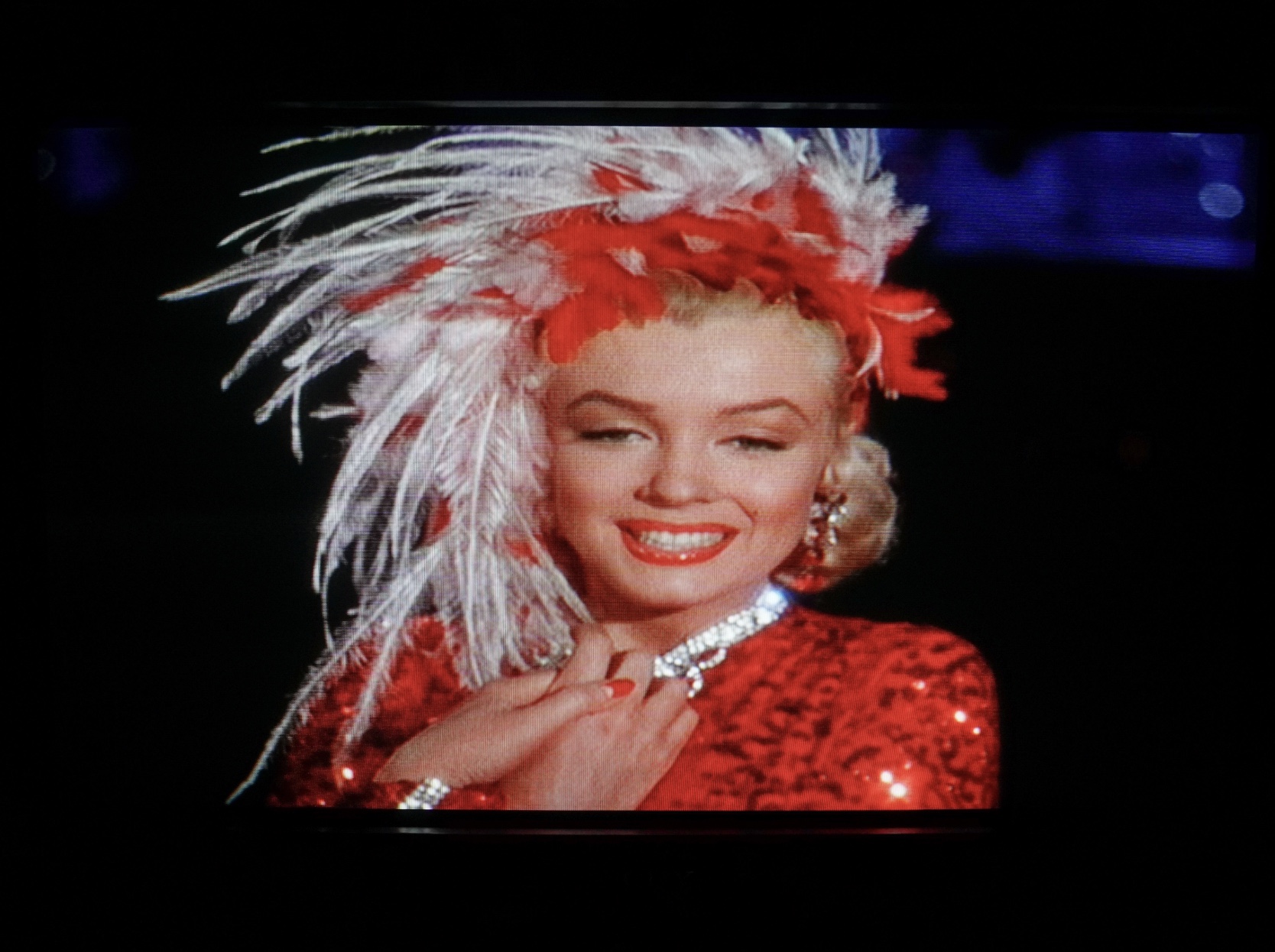
Last edited by etype2; 06-11-2018 at 04:53 PM.
|
|
#249
06-11-2018, 06:55 AM
|
||||
|
||||
|
Some 21AXP22s have NTSC correct phosphors, but not yours. The jug in yours is a later one with the "paper white" colored screen. The NTSC correct tubes have a seafoam green or teak tint to them when off.
Only the 15GP22, 15HP22, 19VP22, and the very earliest run of 21AXP22s have the NTSC correct phosphors. Moreover, asking how the red looks is a moot point: we can't see what you can see in person. We're limited by the color gamut your camera can capture, which is almost assuredly smaller than the 1953 NTSC gamut, and by our displays, which again probably can't show a terribly "deep" red.
|
|
#251
06-11-2018, 10:06 AM
|
||||
|
||||
|
Quote:
|
|
#252
06-11-2018, 11:46 AM
|
||||
|
||||
|
Having examples of both sets the OP has on hand I can say that the Sony tends to have an overly bright/contrasty picture. Whites with brightness at min beat other vintage sets with brightness at max, and contrast sometimes pushes very dark colors into cutoff killing some shadow detail in images...He may have found a way to beat this on his Sony though.
I plan to look for sub-brightness and other things when I get arround to doing into the service menu to correct the overscan on my sony.
__________________
Tom C. Zenith: The quality stays in EVEN after the name falls off! What I want. --> http://www.videokarma.org/showpost.p...62&postcount=4
|
|
#253
06-11-2018, 02:40 PM
|
||||
|
||||
|
Quote:
|
|
#254
06-11-2018, 02:43 PM
|
||||
|
||||
|
Quote:
Last edited by etype2; 06-11-2018 at 03:11 PM.
|
|
#255
06-11-2018, 02:47 PM
|
||||
|
||||
|
Quote:
|
| Audiokarma |
 |
|
|


 Personal website dedicated to Vintage Television


 Linear Mode

