Videokarma.org

Go Back   Videokarma.org TV - Video - Vintage Television & Radio Forums > Early Color Television

We appreciate your help

in keeping this site going.
Reply
 
Thread Tools Display Modes
  #256  
Old 10-03-2019, 10:31 PM
etype2's Avatar
etype2 etype2 is offline
VideoKarma Member
 
Join Date: Mar 2010
Location: Valley of the Sun, formerly Silicon Valley, formerly Packer Land.
Posts: 1,492
Were there ever any broadcasts of 1953 NTSC? I doubt it. Did RCA push for 1953 NTSC or did they engineer the 15GP22 with using them for studio monitors in mind?

My understanding is the industry used SEMPTC which has a lower color gamut. My screen covers DCI P3 which gamut is better then SEMPTC but not as good as 1953 NTSC.
__________________
Personal website dedicated to Vintage Television https://visions4netjournal.com
Reply With Quote
  #257  
Old 10-03-2019, 10:53 PM
old_tv_nut's Avatar
old_tv_nut old_tv_nut is online now
See yourself on Color TV!
 
Join Date: Jul 2004
Location: Rancho Sahuarita
Posts: 7,214
Actually, the TK-41 image orthicon cameras were carefully filtered to match NTSC specs without any color matrixing, so broadcasts were per NTSC until the mid 60s or thereabouts. Meanwhile, the CRTs had changed to sulfide green (moving skin tones toward red) and a blue that was much less cyan than NTSC blue (moving skin tones toward yellow). At first, TV makers didn't change the matrixing in the receiver, went to cyanish white point to save the red gun, and left it to viewers to find a compromise adjustment for acceptable skin tones. Later, TV makers started changing the matrixing to get a better hue range from red through skin hue, orange, yellow and green, but this resulted in full amplitude reds being overly bright. When Plumbicon cameras came, they were matrixed to something sort of like NTSC at first in the US, but correctly for modern phosphors in PAL equipment. Of course, camera makers wanted the color to look decent on studio monitors in the US too, so there were compromise matrix designs going on. The result in the US was like the old joke about the factory whistle being set by the train arrival and the station clock being set according to the factory whistle. At the same time, US TV makers were introducing one-button auto color circuits that essentially moved anything close to skin hue even closer - but at least you could turn it off. SMPTE developed a monitor standard that could have the in-monitor matrix turned on or off. Off for setup and calibration, on to get the correct hue distinction from red to green, but with the over-bright reds. Color matrixing didn't get really sorted out in the US until HD came along and the whole world settled on a single standard, a very close approximation to the European/PAL and SMPTE C, which was also adopted as computer sRGB.

Here's something I wrote on the match of TK-41 cameras to NTSC (15GP22 CRTs) - essentially, the slight discrepancies could be made up easily with small adjustments of the receiver color and hue ("tint") controls. It's based on actual RCA documentation of the early camera color response, which was fortunately one of the few things saved from the trash when XSarnoff LabsX (correction - RCA Camden)closed. Additional edit: The TK41C prism assembly was kindly measured for this paper by Jay Ballard at my request.

http://www.bretl.com/viewing1950scolor.htm

The need for narrowband color trimming filters in the three channels was one reason the TK-41 was so much less sensitive than monochrome cameras. In the earliest experimental cameras, the green spectral response was too much toward blue to match the NTSC green phosphor. This meant that yellow, orange and skin tones put less light into the green channel than they should, and those colors came out too orange or reddish. Observers commented on this, which contributed to the idea that RCA's system did not have as good color as the CBS system. However, this was soon corrected, and the cameras were then actually considerably more accurate than color film when used with the NTSC phosphors.

The later model TK-41C with improved dichroic filters (in a prism block instead of the original thin mirrors) increased the optics efficiency quite a bit because [edited] the trim filters were attached to the prism block and were apparently more efficient (perhaps dichroic). (The prism block also eliminated ghost reflections from the mirrors' second surfaces.)

Looking at the greens on the Wizard of Oz today is very confused, because in restoring the film for DVD and Blu-Ray, the color has been adjusted for current displays, as well as attempting to divine what the original really looked like. The result is that, while the greens on your 15GP22 are impressively saturated and not yellowish, they are being artificially made that way by applying an sRGB signal to NTSC phosphors, and there is no way of telling if that is really accurate or not. Measurements of Technicolor dyes indicate that color saturation that high could only be obtained with quite dark, dense prints - BUT technicolor WAS always printed with high contrast and density, which is what produced the high saturation. So, it's probable there are compensating errors here, and the saturated greens on the 15GP22 are mostly legitimate. Whether they are "correct" or not, they certainly look pleasing.
__________________
www.bretl.com
Old TV literature, New York World's Fair, and other miscellany

Last edited by old_tv_nut; 10-04-2019 at 06:11 PM.
Reply With Quote
  #258  
Old 10-06-2019, 01:26 PM
etype2's Avatar
etype2 etype2 is offline
VideoKarma Member
 
Join Date: Mar 2010
Location: Valley of the Sun, formerly Silicon Valley, formerly Packer Land.
Posts: 1,492
UPDATE, OCTOBER 5, 2019

This update previews screenshots on our recently restored 1954 Westinghouse H840CK15 with 15GP22 CRT. On the screen, the 1948 movie, “The Red Shoes”, a restored three strip Technicolor film. See full resolution 6000 X 4000 images here: https://visions4netjournal.com/westi...r-tv-part-two/

Tap on any image to view high resolution 6000 X 4000 images. The full resolution shots do no have the moire artifact.
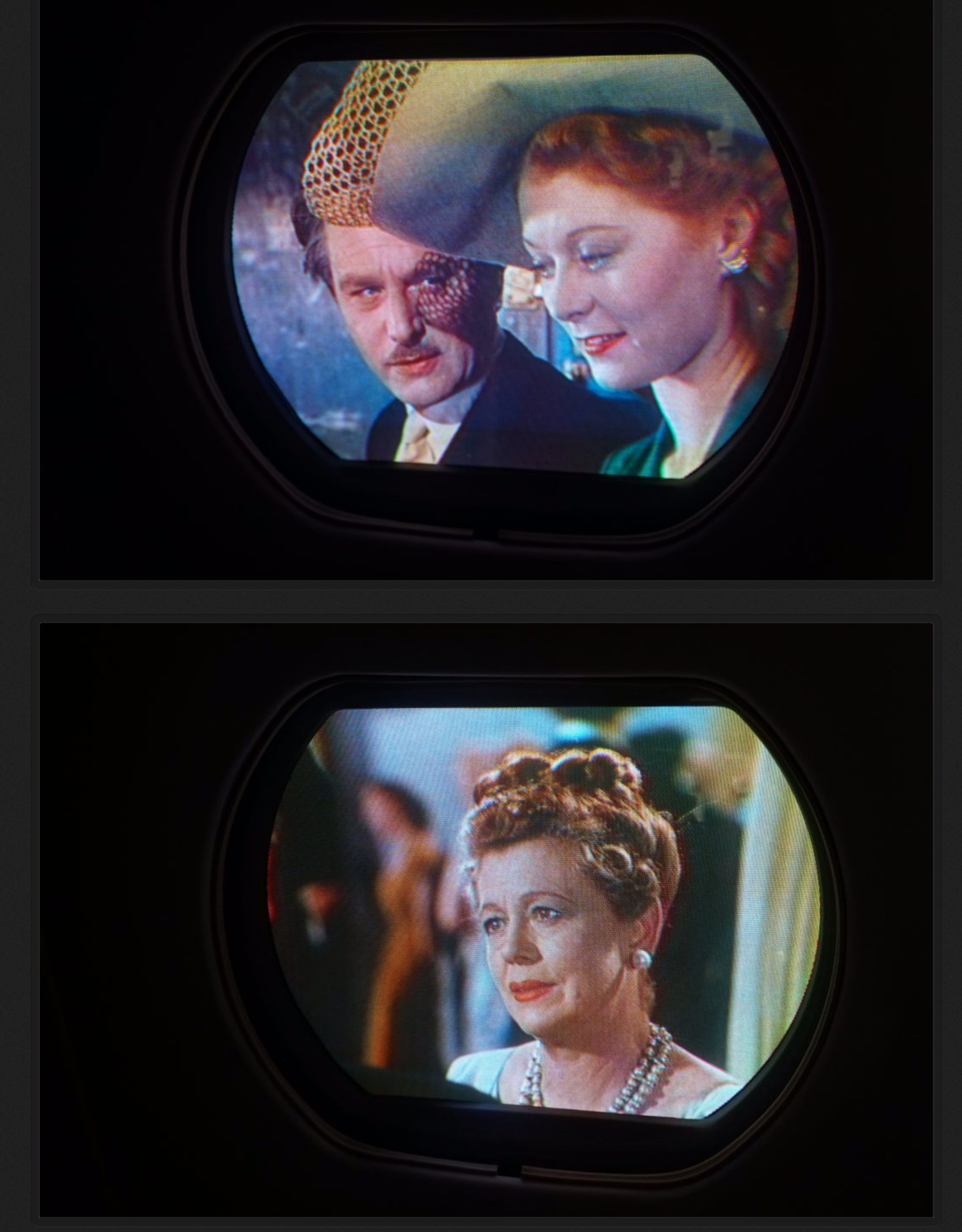
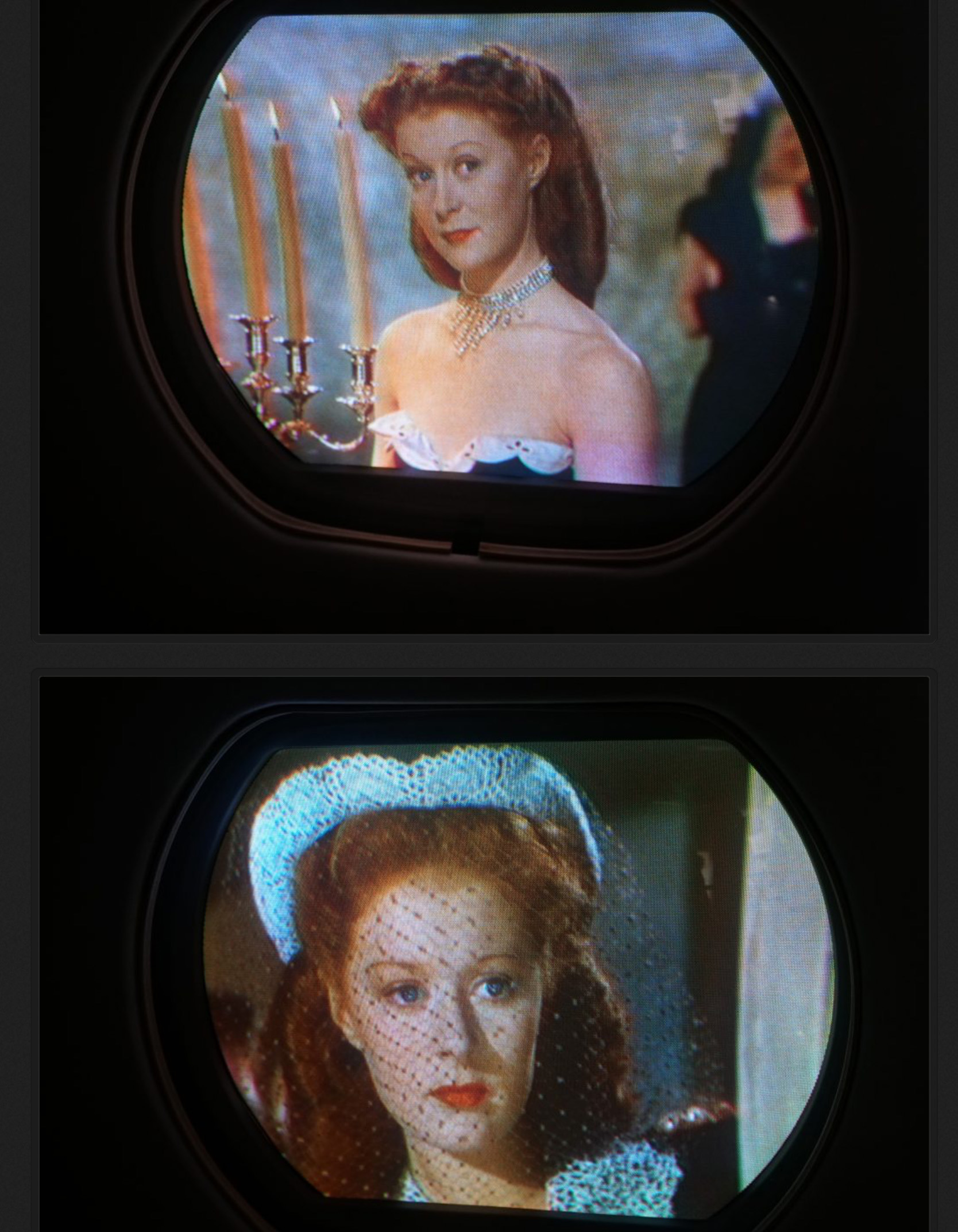


__________________
Personal website dedicated to Vintage Television https://visions4netjournal.com
Reply With Quote
  #259  
Old 10-06-2019, 01:44 PM
kvflyer kvflyer is offline
VideoKarma Member
 
Join Date: Nov 2006
Location: Fernandina Beach, FL
Posts: 1,061
Looks fantastic. It kinda reminds me of the 1960s, when I borrowed a Polaroid Model 80 B/W camera. I realized that there was a color film that would physically fit the camera. But of course, the film was much slower.

I managed to figure out how to take pictures with an external light meter. Success! I was thrilled to see the results.

Congratulations! I realize that this accomplishment is way better than my Polaroid adventure as a teenager. But it sure brought back memories.
Reply With Quote
  #260  
Old 10-06-2019, 06:21 PM
etype2's Avatar
etype2 etype2 is offline
VideoKarma Member
 
Join Date: Mar 2010
Location: Valley of the Sun, formerly Silicon Valley, formerly Packer Land.
Posts: 1,492
UPDATE, OCTOBER 6, 2019

This is an attempt to show the Westy cabinet illuminated and still capture a properly exposed screen image. Shot today at 2PM on a sunny day, windows facing West. No interior lighting except the lamp on the set. The screen image is still over exposed, but not bad. Camera: Sony A6300, 1/40 Sec., F14, AWB.
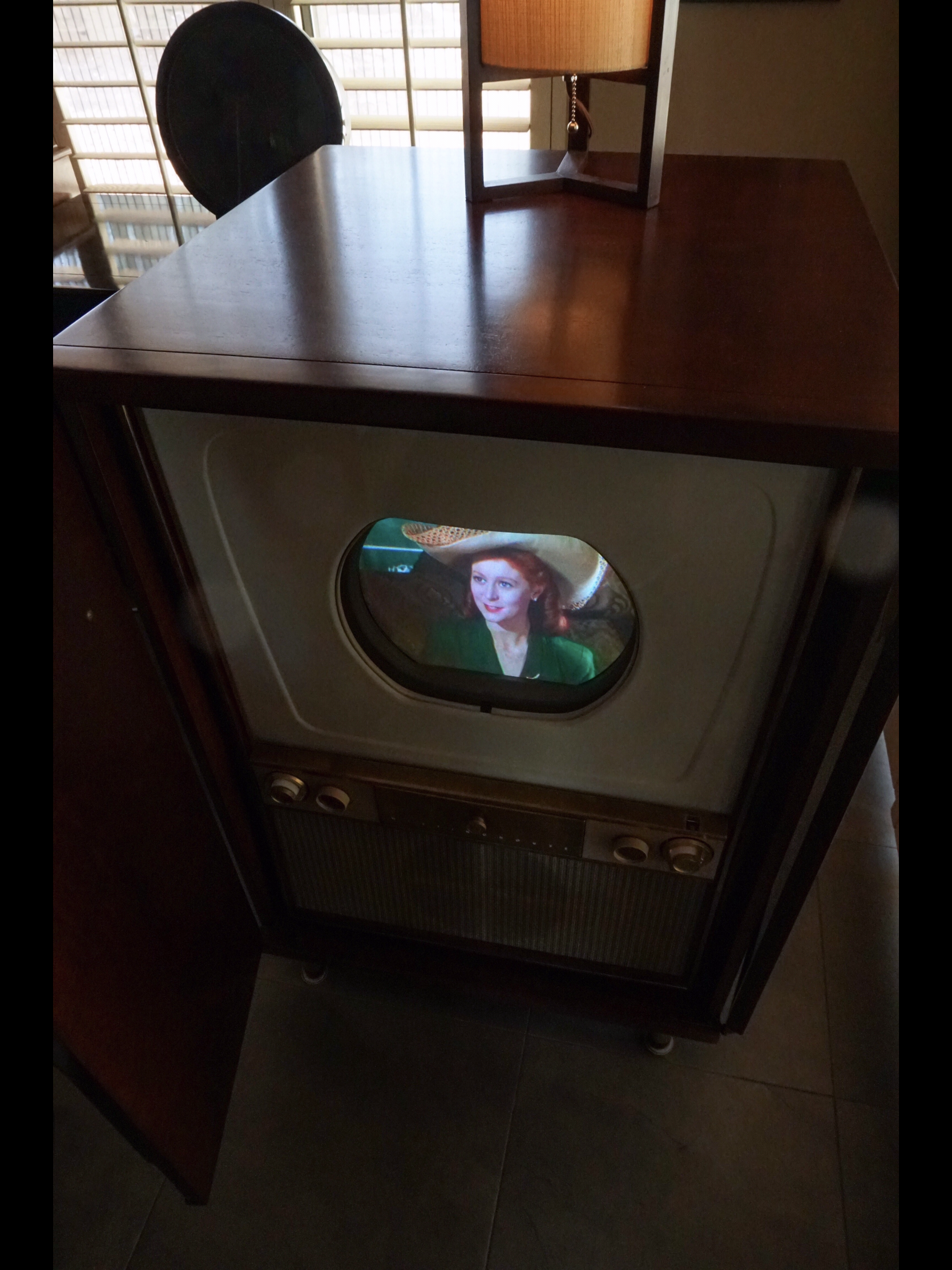
__________________
Personal website dedicated to Vintage Television https://visions4netjournal.com
Reply With Quote
Audiokarma
  #261  
Old 10-07-2019, 05:30 PM
etype2's Avatar
etype2 etype2 is offline
VideoKarma Member
 
Join Date: Mar 2010
Location: Valley of the Sun, formerly Silicon Valley, formerly Packer Land.
Posts: 1,492
Quote:
Originally Posted by old_tv_nut View Post
Actually, the TK-41 image orthicon cameras were carefully filtered to match NTSC specs without any color matrixing, so broadcasts were per NTSC until the mid 60s or thereabouts. Meanwhile, the CRTs had changed to sulfide green (moving skin tones toward red) and a blue that was much less cyan than NTSC blue (moving skin tones toward yellow). At first, TV makers didn't change the matrixing in the receiver, went to cyanish white point to save the red gun, and left it to viewers to find a compromise adjustment for acceptable skin tones. Later, TV makers started changing the matrixing to get a better hue range from red through skin hue, orange, yellow and green, but this resulted in full amplitude reds being overly bright. When Plumbicon cameras came, they were matrixed to something sort of like NTSC at first in the US, but correctly for modern phosphors in PAL equipment. Of course, camera makers wanted the color to look decent on studio monitors in the US too, so there were compromise matrix designs going on. The result in the US was like the old joke about the factory whistle being set by the train arrival and the station clock being set according to the factory whistle. At the same time, US TV makers were introducing one-button auto color circuits that essentially moved anything close to skin hue even closer - but at least you could turn it off. SMPTE developed a monitor standard that could have the in-monitor matrix turned on or off. Off for setup and calibration, on to get the correct hue distinction from red to green, but with the over-bright reds. Color matrixing didn't get really sorted out in the US until HD came along and the whole world settled on a single standard, a very close approximation to the European/PAL and SMPTE C, which was also adopted as computer sRGB.

Here's something I wrote on the match of TK-41 cameras to NTSC (15GP22 CRTs) - essentially, the slight discrepancies could be made up easily with small adjustments of the receiver color and hue ("tint") controls. It's based on actual RCA documentation of the early camera color response, which was fortunately one of the few things saved from the trash when XSarnoff LabsX (correction - RCA Camden)closed. Additional edit: The TK41C prism assembly was kindly measured for this paper by Jay Ballard at my request.

http://www.bretl.com/viewing1950scolor.htm

The need for narrowband color trimming filters in the three channels was one reason the TK-41 was so much less sensitive than monochrome cameras. In the earliest experimental cameras, the green spectral response was too much toward blue to match the NTSC green phosphor. This meant that yellow, orange and skin tones put less light into the green channel than they should, and those colors came out too orange or reddish. Observers commented on this, which contributed to the idea that RCA's system did not have as good color as the CBS system. However, this was soon corrected, and the cameras were then actually considerably more accurate than color film when used with the NTSC phosphors.

The later model TK-41C with improved dichroic filters (in a prism block instead of the original thin mirrors) increased the optics efficiency quite a bit because [edited] the trim filters were attached to the prism block and were apparently more efficient (perhaps dichroic). (The prism block also eliminated ghost reflections from the mirrors' second surfaces.)

Looking at the greens on the Wizard of Oz today is very confused, because in restoring the film for DVD and Blu-Ray, the color has been adjusted for current displays, as well as attempting to divine what the original really looked like. The result is that, while the greens on your 15GP22 are impressively saturated and not yellowish, they are being artificially made that way by applying an sRGB signal to NTSC phosphors, and there is no way of telling if that is really accurate or not. Measurements of Technicolor dyes indicate that color saturation that high could only be obtained with quite dark, dense prints - BUT technicolor WAS always printed with high contrast and density, which is what produced the high saturation. So, it's probable there are compensating errors here, and the saturated greens on the 15GP22 are mostly legitimate. Whether they are "correct" or not, they certainly look pleasing.
Informative article, thank you you for posting. The last paragraph applies to what I’m seeing on my Westy.

The first photo, taken from the internet is close to what I see on my set, deep saturated green although, the green is more like forest green.

The second photo: My camera rejects the green I see on screen and displays wrong.

The third photo is my cut and paste method. On a tripod, cabinet shot with daylight, then shot in the dark from same position on the tripod. The image from the dark shot is “cut” and then “pasted” onto the daylight shot.


__________________
Personal website dedicated to Vintage Television https://visions4netjournal.com
Reply With Quote
  #262  
Old 10-08-2019, 09:49 AM
bluenorm's Avatar
bluenorm bluenorm is offline
VideoKarma Member
 
Join Date: Feb 2008
Location: East Village NYC
Posts: 140
geez what a beautiful tv set.
Reply With Quote
  #263  
Old 10-08-2019, 10:42 AM
old_tv_nut's Avatar
old_tv_nut old_tv_nut is online now
See yourself on Color TV!
 
Join Date: Jul 2004
Location: Rancho Sahuarita
Posts: 7,214
Quote:
Originally Posted by etype2 View Post
The second photo: My camera rejects the green I see on screen and displays wrong.
[Thought I posted this question yesterday, but don't see it]

Do his buttons appear so blue/cyan to your eye, or is that totally your camera?
__________________
www.bretl.com
Old TV literature, New York World's Fair, and other miscellany
Reply With Quote
  #264  
Old 10-08-2019, 11:11 AM
freakaftr8's Avatar
freakaftr8 freakaftr8 is offline
Convergence freak!
 
Join Date: Sep 2007
Location: Folsom, CA (no not in the prison)
Posts: 1,778
That's one impressive picture! I've watched videos on convergence setup, at least on the CT100, if this is similar. Hats off to you on that!
__________________
Honey, turn on the tv.. I'm cold!
Reply With Quote
  #265  
Old 10-08-2019, 11:59 AM
etype2's Avatar
etype2 etype2 is offline
VideoKarma Member
 
Join Date: Mar 2010
Location: Valley of the Sun, formerly Silicon Valley, formerly Packer Land.
Posts: 1,492
Quote:
Originally Posted by bluenorm View Post
geez what a beautiful tv set.
Thank you. :-)
__________________
Personal website dedicated to Vintage Television https://visions4netjournal.com
Reply With Quote
Audiokarma
  #266  
Old 10-08-2019, 12:13 PM
etype2's Avatar
etype2 etype2 is offline
VideoKarma Member
 
Join Date: Mar 2010
Location: Valley of the Sun, formerly Silicon Valley, formerly Packer Land.
Posts: 1,492
Quote:
Originally Posted by old_tv_nut View Post
[Thought I posted this question yesterday, but don't see it]

Do his buttons appear so blue/cyan to your eye, or is that totally your camera?
It’s the camera. The 15GP22 green looks deep and saturated, I see it on the live viewfinder, then the camera process’s the shot for a second and the completed image green looks pastel. I have not seen this effect with this camera since I got it two years ago. At first I thought I could correct the problem. I tried shutter priority and aperture priority. In the past few days, found that F13/1/40second looks good. I still can’t get rid of that pesky scanning bar. Different setting produces different results with the bar from thin and dark amber to wide and faded bar to no bar at all. Not understanding the process’s going on.

Here is another shot with the buttons less blue. Now the entire shot looks more blue. I was learning the set and the camera setting on this shot. I will check this shot during the next photography session.
__________________
Personal website dedicated to Vintage Television https://visions4netjournal.com

Last edited by etype2; 10-08-2019 at 12:16 PM.
Reply With Quote
  #267  
Old 10-08-2019, 12:18 PM
etype2's Avatar
etype2 etype2 is offline
VideoKarma Member
 
Join Date: Mar 2010
Location: Valley of the Sun, formerly Silicon Valley, formerly Packer Land.
Posts: 1,492
Quote:
Originally Posted by freakaftr8 View Post
That's one impressive picture! I've watched videos on convergence setup, at least on the CT100, if this is similar. Hats off to you on that!
Thanks. The Westy convergence procedure is different. Maybe someone else can chime in on this.
__________________
Personal website dedicated to Vintage Television https://visions4netjournal.com
Reply With Quote
  #268  
Old 10-08-2019, 04:12 PM
old_tv_nut's Avatar
old_tv_nut old_tv_nut is online now
See yourself on Color TV!
 
Join Date: Jul 2004
Location: Rancho Sahuarita
Posts: 7,214
1/40 second is too short to capture a full frame- that's why you get the shutter bar. You need to shoot 1/30 or preferably 1/15 (although this will invite motion blur from multiple frames unless you still-frame your player). The short shutter time will also cause color changes because the 15GP22 phosphors have greatly different persistence.

For best color, I suggest using still frame, a slower shutter, and a tripod of course. If your camera is resolving the phosphor dots, they may be overexposed even when the average exposure is correct, so it's a good idea to adjust your exposure darker and then increase the brightness in post processing.

This was always a problem in photographing TV pictures, even film photos of black and white TVs. The average brightness consisted of the bright scan lines and the dark spaces in between, resulting in a picture with odd contrast tones because the average consisted of black spaces and over-exposed picture scanning lines. The same thing could happen with color TVs and high-resolution digital cameras.
__________________
www.bretl.com
Old TV literature, New York World's Fair, and other miscellany
Reply With Quote
  #269  
Old 10-08-2019, 04:21 PM
etype2's Avatar
etype2 etype2 is offline
VideoKarma Member
 
Join Date: Mar 2010
Location: Valley of the Sun, formerly Silicon Valley, formerly Packer Land.
Posts: 1,492
I will try that in the next round of photography. I will place the camera closer to the screen to check the phosphor dots.
__________________
Personal website dedicated to Vintage Television https://visions4netjournal.com
Reply With Quote
  #270  
Old 10-09-2019, 03:35 PM
etype2's Avatar
etype2 etype2 is offline
VideoKarma Member
 
Join Date: Mar 2010
Location: Valley of the Sun, formerly Silicon Valley, formerly Packer Land.
Posts: 1,492
UPDATE, OCTOBER 9, 2019

New screenshots taken today, October 9, 2019 from Gone With The Wind, a 1939 three strip Technicolor film on my Westinghouse H840CK15. At the suggestion of a VideoKarma forum member, we placed the camera on a tripod and used freeze frame. These shots were taken by a Sony A6300 mirrorless camera. The camera lens was set up about 16 inches from the screen, 20mm, SS 1/25 sec., between F13 to F16, AWB. As predicted, the shutter bar has been largely eliminated and the pixel dots are resolved.

The photos below are screen captures. The full resolution shots are 6000 X 4000.


__________________
Personal website dedicated to Vintage Television https://visions4netjournal.com

Last edited by etype2; 10-13-2019 at 03:21 AM.
Reply With Quote
Audiokarma
Reply


Posting Rules
You may not post new threads
You may not post replies
You may not post attachments
You may not edit your posts

BB code is On
Smilies are On
[IMG] code is On
HTML code is Off

Forum Jump


All times are GMT -5. The time now is 12:25 PM.


Powered by vBulletin® Version 3.8.4
Copyright ©2000 - 2024, Jelsoft Enterprises Ltd.
©Copyright 2012 VideoKarma.org, All rights reserved.