
|
|
|
#1
 04-16-2022, 06:27 PM
|
||||
|
||||
|
Happy Easter - CTC-5
Ukrainian/Polish Easter eggs on the old beast...
 

|
|
#2
04-16-2022, 06:41 PM
|
|||
|
|||
|
Sweet RCA roundie next to a Zenith console, hardwood floors just like at great grandma's place. Very nice
|
|
#5
04-19-2022, 06:01 AM
|
||||
|
||||
|
Nice color!
__________________
My TV page and YouTube channel Kyocera R-661, Yamaha RX-V2200 National Panasonic SA-5800 Sansui 1000a, 1000, SAX-200, 5050, 9090DB, 881, SR-636, SC-3000, AT-20 Pioneer SX-939, ER-420, SM-B201 Motorola SK77W-2Z tube console McIntosh MC2205, C26 
|
| Audiokarma |
|
#7
04-22-2022, 05:55 PM
|
||||
|
||||
|
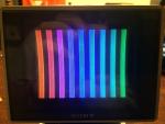
With the relatively poor video response of the CTC-5 chassis, I've learned that the right font size combined with a black outline makes a huge difference in the readability and therefore apparent sharpness. The black outline in particular makes a much greater improvement than I would have guessed.
Here's a look at the result right out of the camera without adjusting the highlights, shadows, and white balance (and fixing the camera tilt). 
|
|
#9
04-27-2022, 10:11 PM
|
||||
|
||||
|
Quote:
Can you explain further specifically what you mean by "poor video response"? Terry
|
|
#10
04-27-2022, 11:48 PM
|
|||
|
|||
|
I can't speak for the CTC-5 specifically but all of the later RCA roundies I remember were quite sharp despite the frosted faceplate.
|
| Audiokarma |
|
#12
04-28-2022, 10:55 AM
|
||||
|
||||
|
Quote:
|
|
#13
04-28-2022, 03:08 PM
|
||||
|
||||
|
I wonder if it may be an video IF alignment problem? The luma response is no different than the deluxe model.
My VIF test is while viewing the resolution chart, to simply rotate the fine tuning control and see if the resolution markedly improves as the video carrier descends the nyquist slope. It could be the video carrier is sitting above the 50% point. I found in my CTC5 the RCA or phono connector which attaches the IF coax from the main chassis to the tuner, if dirty, will move the carrier to high.
|
|
#14
04-28-2022, 08:36 PM
|
||||
|
||||
|
Quote:
This Super chassis is full of questionable cost cutting attempts. RCA learned their lesson that it wasn't worth it and never sold a low grade color chassis series simultaneously with a good one again. Another example, it really needs the audio carrier amp/limiter stage that the better chassis has. If you tune the audio trap dead-on in this chassis, you practically lose audio. It has to be tweaked a bit off to get acceptable volume, hopefully without introducing 920 kHz beats in the picture.
|
|
#15
05-03-2022, 07:16 AM
|
||||
|
||||
|
Quote:
The added Chroma bandwith on the Deluxe means that you should see more chroma detail. Although the Deluxe uniquely for this one chassis only employed wide band equiband chroma demodulation which implies quadrature crosstalk at the higher chroma frequencies. I wonder if in the end there was really that much added benefit since subsequently RCA never employed the wideband chroma again? As for the added sound IF stage, I agree there is added benefit. To me it imples the added sufficient signal at the ratio detector to improve limiting and remove AM ingress. Certainlt the CTC-5 Deluxe has the best intercarrier sound compared to other sets I have compared of the era.
|
| Audiokarma |
 |
| Thread Tools | |
| Display Modes | |
|
|









 Linear Mode

